How the anatomy of a luxury product page — from image sequencing to pricing psychology — creates desire that transcends comparison and justifies the highest price points.
Each element of a product page performs a specific role in the journey from discovery to decision. In luxury, that journey must be choreographed, not left to chance.
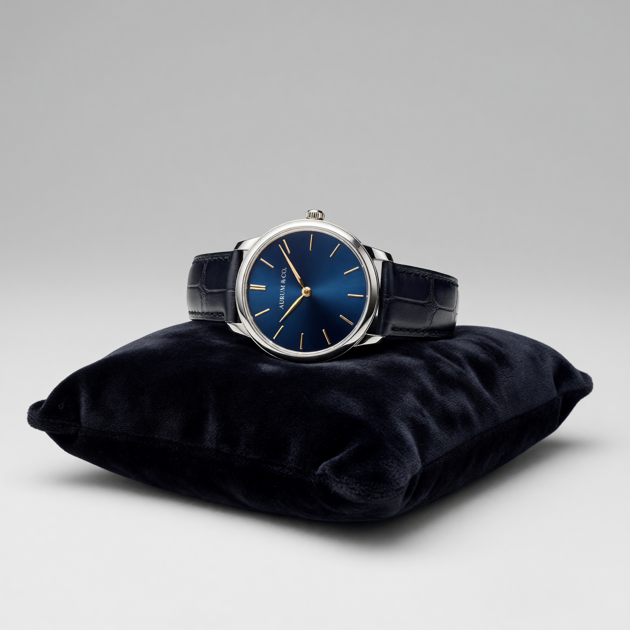
First impression, last impression. Must render material quality with absolute fidelity. No lifestyle imagery on hero — the product is the star, uncompromised.
Follow the desire arc: overview → detail → context → scale. Each subsequent image deepens the emotional attachment, making the product feel increasingly inevitable.
Luxury pricing is displayed once, clearly, without context or comparison. No "Was / Now". No competitor references. The price stands alone as a statement of value.
300–500 words of genuine craftsmanship storytelling. Not specifications — provenance. Not features — heritage. The text is not copy; it is a letter from the maker.
One call to action. Never two. The luxury purchase is a singular decision, not a comparison. The button label speaks of acquisition, not transaction: "Make It Yours".
Annotated example of a high-end product page structure, applied to a fine jewellery item.


Handset with 147 VVS1 diamonds totalling 4.2 carats, suspended from a hand-drawn 18k white gold chain. Each necklace requires 340 hours of atelier time across three generations of craftsmen in our Tokyo workshop. Delivered in a bespoke lacquered box with white glove service.

The watch industry pioneered luxury product presentation online. From Patek Philippe's "You never actually own a Patek Philippe" to A. Lange & Söhne's technical editorial photography — their approach offers the most instructive case studies for high-ticket eCommerce design.
The lesson: specifications serve as poetry, not data. "316 components assembled by a single master watchmaker over 14 months" is not information — it is romance. Your product descriptions must transform specification into aspiration.
Typography Guide →How products are arranged collectively shapes perceived brand tier as powerfully as individual product presentation.
Full-screen product presentation with zero competition for attention. Signals absolute confidence in each individual item's desirability and value.
Asymmetric pairs with alternating scale create visual tension and flow. Allows curation storytelling between adjacent products.
The limit of luxury grids. Four columns signals mass-market thinking. Three, properly spaced, maintains editorial quality while enabling discovery.