The micro-decisions that separate a luxury brand from a merely expensive one — colour systems, logo philosophy, sensory details, and the invisible architecture of trust.
Colour choice is not aesthetic — it is positioning. Each palette communicates a distinct luxury tier and customer profile.
Near-black ink, warm bone white, and graduated gold tones. The palette of auction houses, grand hotels, and generational jewellery houses. Timeless beyond trend.
Deep forest greens, aged parchment, and sage tones. The palette of luxury organic skincare, estate wines, and premium wellness brands targeting conscious affluence.
Warm taupe, natural linen, and cognac leather tones. Communicates material warmth and artisan craft — the palette of small-batch leather goods and high-design interiors.
In luxury, the logo is not a symbol of recognition — it is a declaration of identity. The finest luxury wordmarks need no icon, no tagline, no colour to communicate status.
Wide letter-spacing in a refined serif creates the visual language of Parisian haute couture. The spacing says: we are unhurried. We have nothing to prove. This is how you type money.
Maximum tracking in the lightest available weight. The wordmark becomes almost architectural — more composition than text. Used by premium beauty, skincare, and experience brands.
A single-word italic in gold on dark background. Immediate luxury signal — the combination of italic calligraphic quality with precious metal tone creates unmistakable premium positioning.
The establishment date — if genuine — is a powerful luxury signal. "Est. 1987" communicates 38 years of craft refinement. The vertical rule creates structural authority.

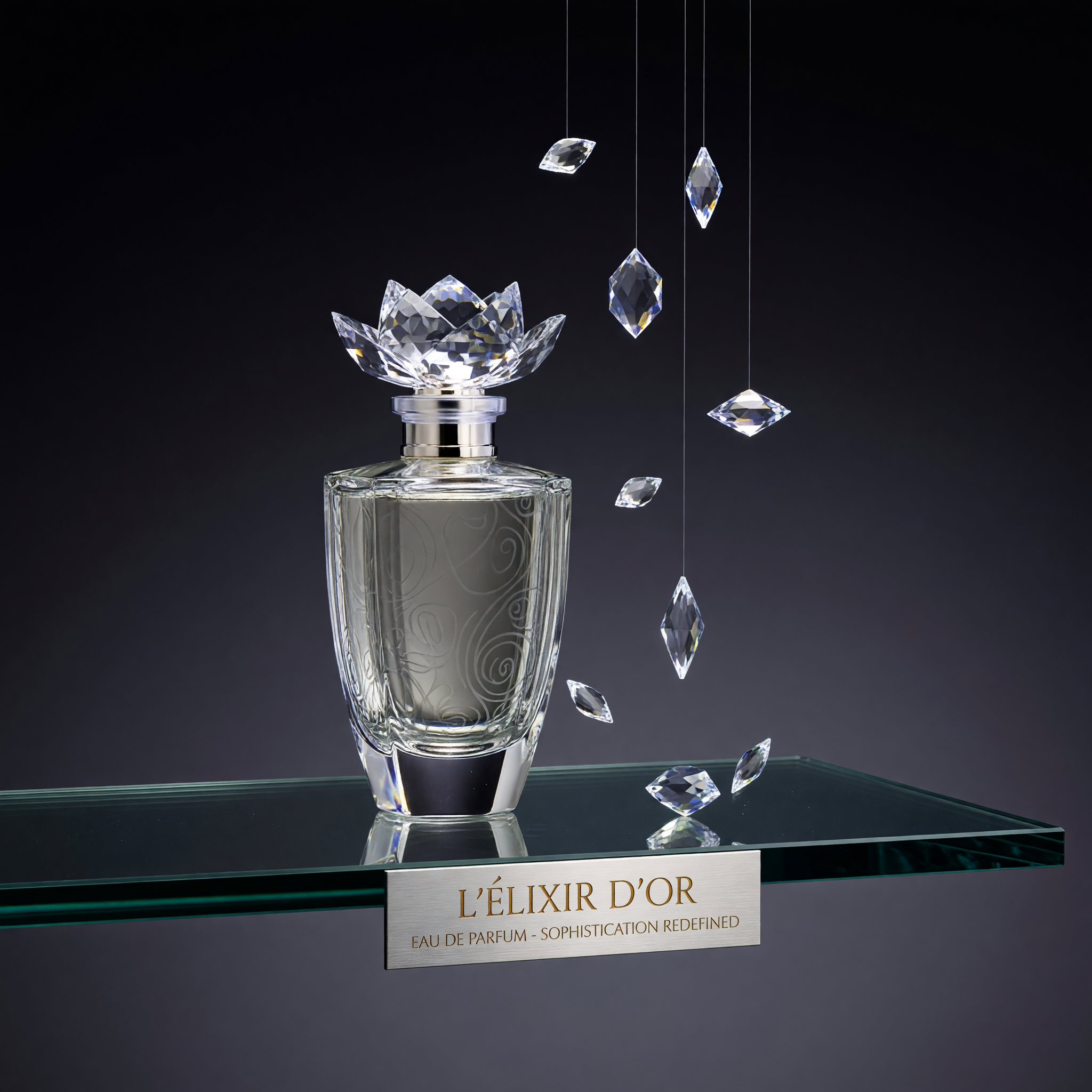
In luxury fragrance, the bottle is often worth more in design investment than the juice inside it. The glass object — its weight, its proportions, the way it catches light on a glass shelf — is the most powerful branding tool available.
Translating this to eCommerce means presenting packaging as the hero, not an afterthought. The unboxing, the tissue, the note card, the box weight — these details must be photographed, described, and celebrated. They are the experience that justifies the price.
Brand ConsultationThese invisible elements are what separate a luxury brand experience from a merely premium one. Customers cannot name them — but they feel them.
A 400ms delay between click and content communicates slowness. But a graceful 200ms fade in — with loading elegance — communicates quality. The loading experience is branded.
Custom cursors — particularly subtle gold rings or minimal arrows — signal design intentionality at the most granular level. The cursor is the user's tool; making it beautiful is an act of respect.
"Your cart is currently empty." vs "Your selection awaits." Both say the same thing. Only one is luxury. Every system message must be written in the brand's voice — even errors.
"Add to cart" is mass-market language. "Reserve" or "Acquire" signals privilege. Every CTA label should reflect the brand's relationship with its customer: curator, not retailer.
Check each element your brand currently has in place. The more you check, the stronger your luxury positioning.
Only the name — in the right face, at the right weight.
Every shade documented with Pantone and HEX references.
Usage rules established for every context.
From homepage copy to error messages — consistent voice.
Reference images, lighting notes, casting direction.
Box weight, tissue grade, ribbon quality all documented.
Confirmation email, tracking page, delivery ritual defined.
Origin, craft, founder philosophy — authentic, not invented.
Select the elements above that your brand currently has in place to calculate your luxury identity score.
Get Full Brand Audit