How spatial architecture, grid systems, and deliberate proportion transform a digital storefront into a space that radiates exclusivity and commands premium pricing.
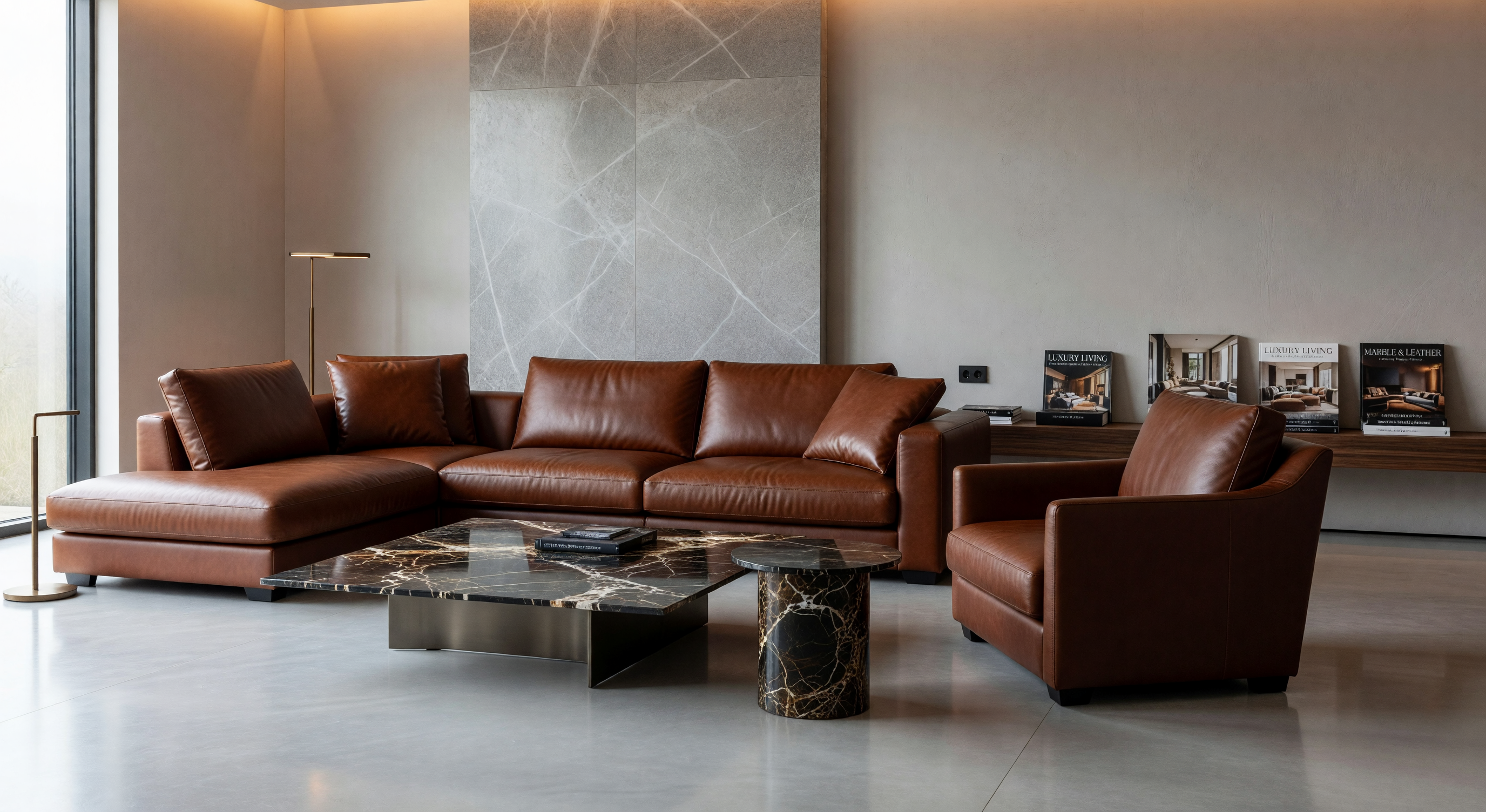
Before a customer reads a single word or sees a single product, space communicates. The ratio of content to emptiness, the rhythm of sections, the breathing room between elements — these are the first messages your brand sends.
Luxury houses like Loro Piana and The Row invest enormous resources in spatial architecture precisely because they understand: generosity of space signals generosity of price. A crowded layout communicates discount; an open layout communicates premium.
Explore Our ServicesEach layout archetype sends different signals. Choosing the right one for your category is strategic, not aesthetic.

Modelled on fashion magazines, this asymmetric grid uses oversized imagery with minimal text, creating a gallery-like experience that signals curatorial taste.

Extreme white space with a single focal point per viewport. Used by ultra-premium jewellery and haute couture. The product is shrine; the page, its temple.

Inspired by Parisian ateliers, this layout balances craft narratives with product imagery in a structured yet intimate grid that conveys heritage and mastery.

Full-viewport sections with parallax and cinematic transitions. Best for experiential luxury — yachts, jets, real estate — where aspiration must be viscerally felt.

Structured like a private membership portal — personalised greetings, curated selections, discovery paths. Conveys service over commerce, loyalty over transaction.

Timeline layouts, archival photography, and founder stories create a sense of institutional legitimacy that newer brands can use to accelerate trust-building.
No less than 60% of any viewport should be negative space. Content should occupy the minority — concentrated, intentional, irresistible.
Perfectly centred layouts feel corporate. Slight asymmetry — offset imagery, uneven text columns — creates visual tension that mirrors the dynamism of great fashion.
Proportions derived from the golden ratio (1:1.618) appear throughout luxury design — from canvas proportions to type size ratios — and create innate visual harmony.
Consistent baseline grid alignment creates a meditative scrolling experience. Each section breathes at the same tempo, creating subconscious comfort and trust.
"Luxury is the ease of a T-shirt in a very expensive dress."— Karl Lagerfeld
The same principle applies to digital design. Luxury layouts should feel effortless — the craft invisible, the experience simply correct.
Request a Layout Audit